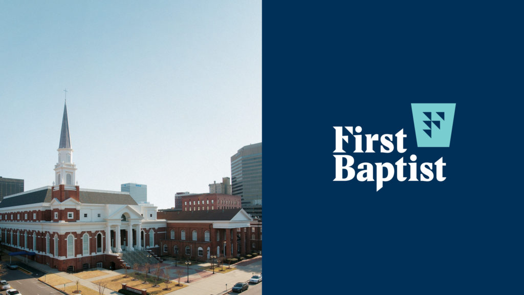
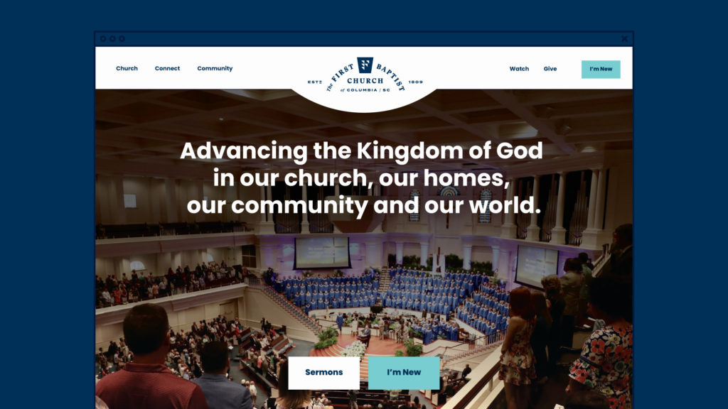
Rebranding an historic downtown church — acknowledging its legacy, pointing toward the future.
Project Scope
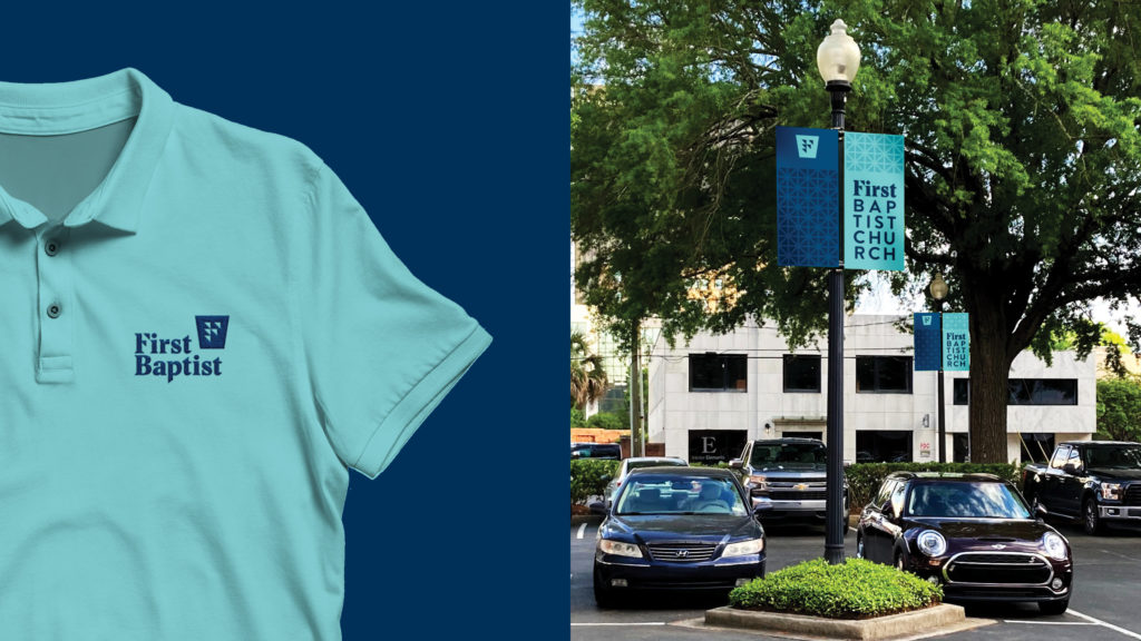
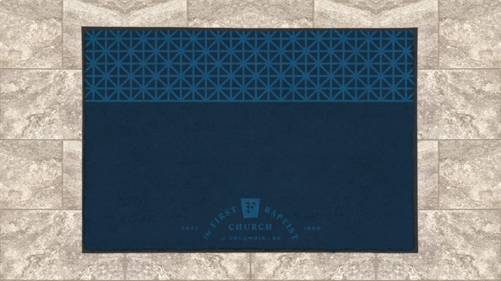
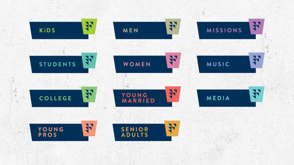
Branding Identity System Logo Design Signage
Brand Identity
The goal of this rebrand was to pay homage to the rich heritage of the 200+ year old church, while creating a forward focused identity that could carry the current congregation into the future.
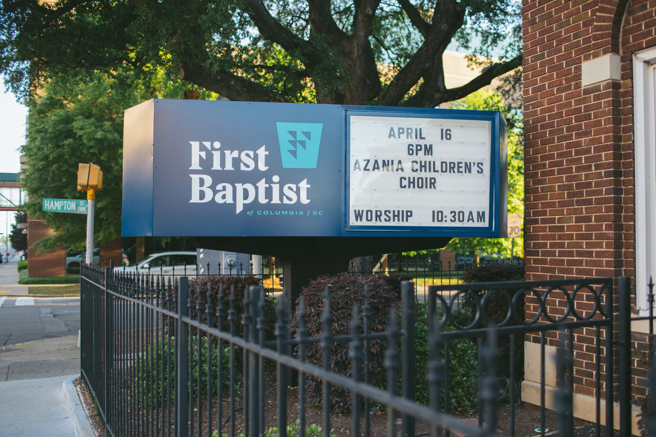
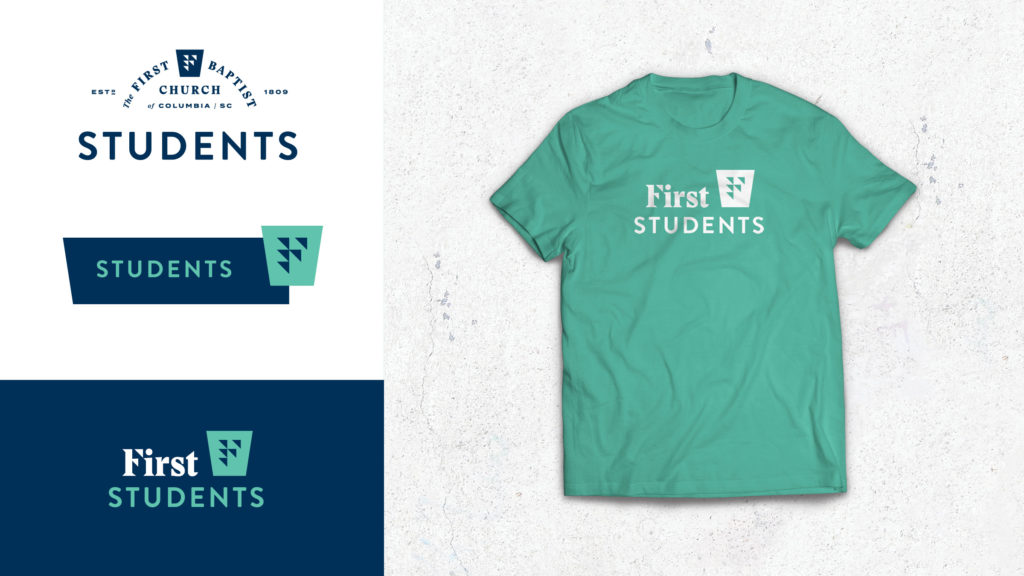
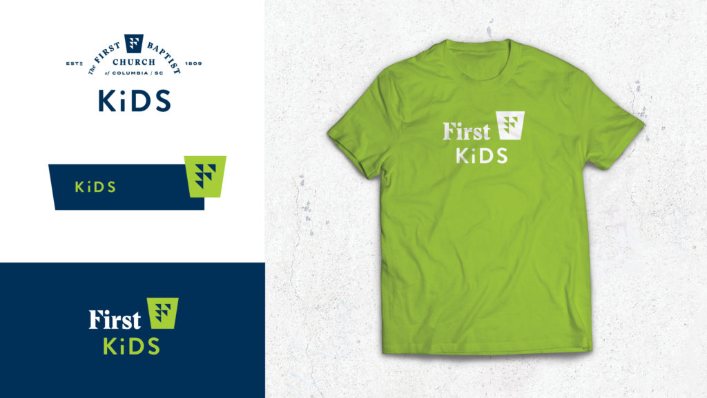
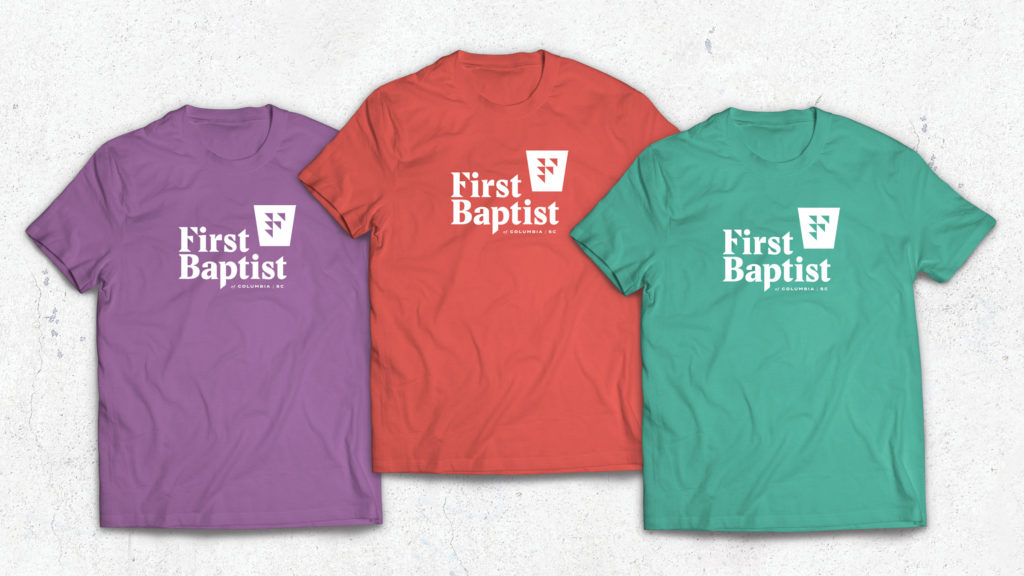
The new church logo is a stylized F, built out of arrows that come together pointing both forward and upward, symbolizing their mission as a community of believers obeying the Savior’s call to “advance the kingdom in our church, our community, our homes, and our world.”
The shape behind the F is a keystone; an element of the church’s architecture that has been used in every building on the church property, including ones that did not originally belong to the church. The keystone visually represents the church’s foundational architecture, but further symbolizes its dependence upon Christ.
The typography for the name is bold and strong, as faith should be. The letter forms have traditional structures, but modern accents. Much like the church itself, the typographic styles acknowledge the history, but lean forward into the future.