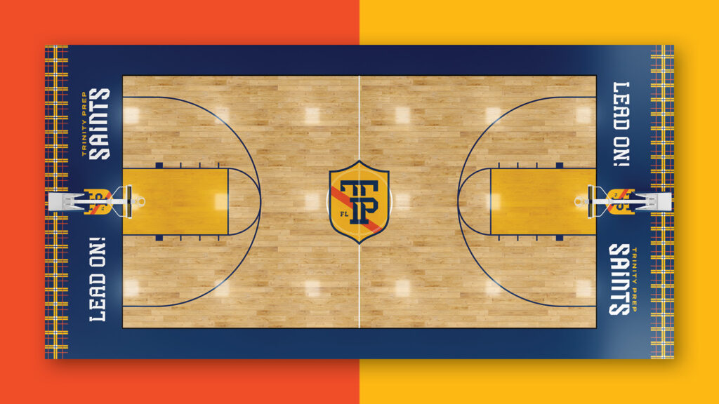
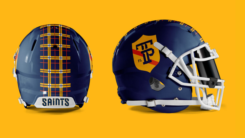
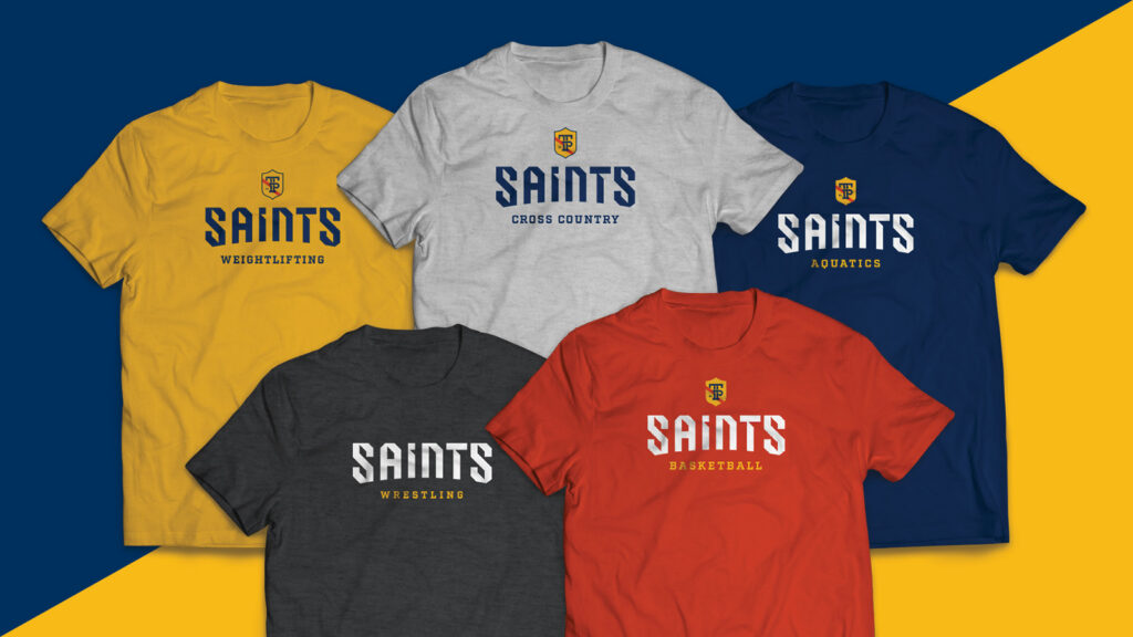
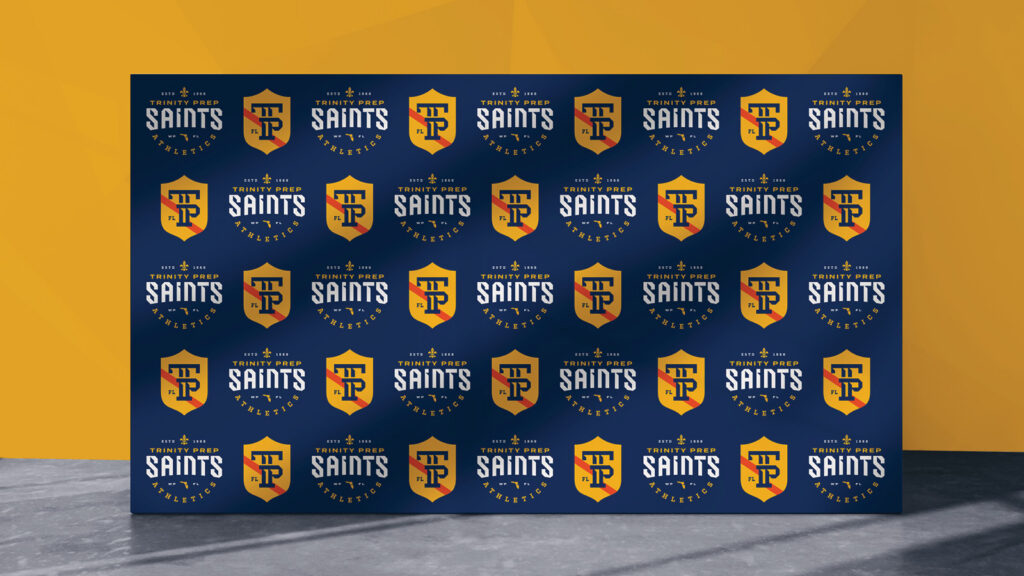
Trinity Prep Athletics has a tradition of excellence — they just needed a visual identity to match. We developed a cohesive athletics brand system rooted in what already made Trinity, Trinity: the shield, the classic fleur de lis, and the school’s signature colors, all carried forward and reinterpreted through an athletic lens. A custom typeface gave the system its own distinct voice while keeping it unmistakably on-brand for the school. Location-specific details and a unifying tagline round out an identity that’s clean and modern without losing its connection to the school’s heritage.